Coqueli-what? The Red You Didn’t Know You Loved
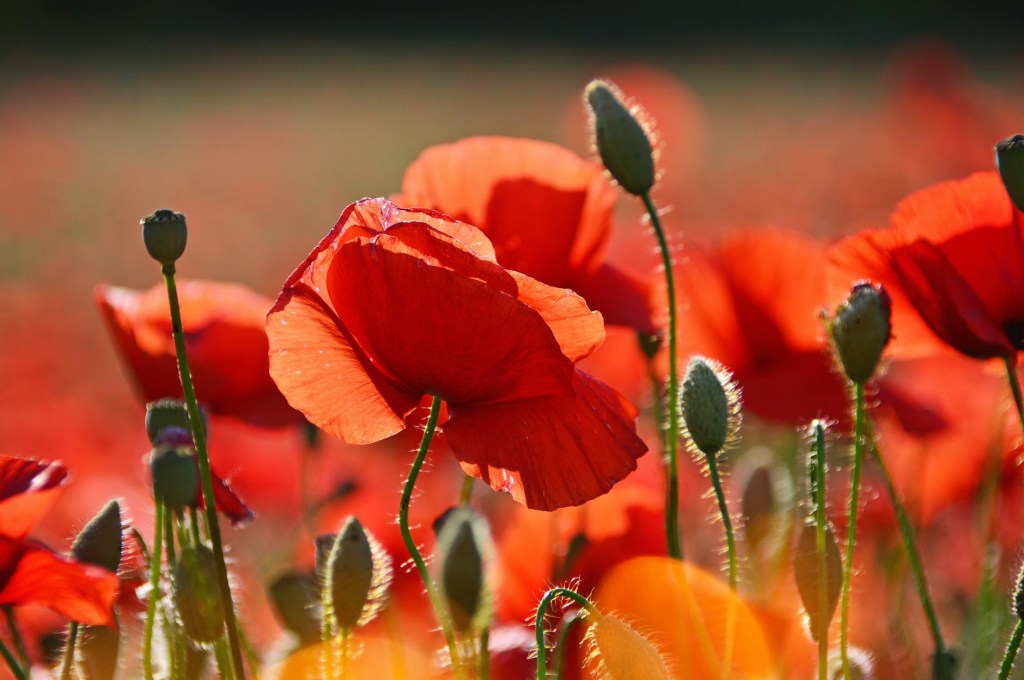
Poppies. What color actually are they… Red? No, orange? Ro-range?
The true color of poppies is called coquelicot. The name is derived from the French word for the wild corn poppy, and was introduced into the English language as coquelicot. It was also a staple color on the palettes of Fauvist painters during the 19th century!
This is no simple color! In my research and creation of a Pinterest mood board to accompany this post, I found that most of the fashion photos I was looking through on Pinterest wanted to lean too far to the red side of the color. Making the red appear almost like tomato red, or cherry red but claiming to be ‘poppy red’. Then, if I searched for red-orange photos they leaned too far to the orange side of the color’s profile. It was few and far between finding the perfect shade of coquelicot. It is not a common color name so searching by its name yielded few promising results!
Since deciding to write on this color I have been on the hunt to find something, a dress, a pillow, or a scarf in this color in real life but each time it’s just not quite right! Let me know in the comments if you’ve found something the perfect shade of coquelicot.
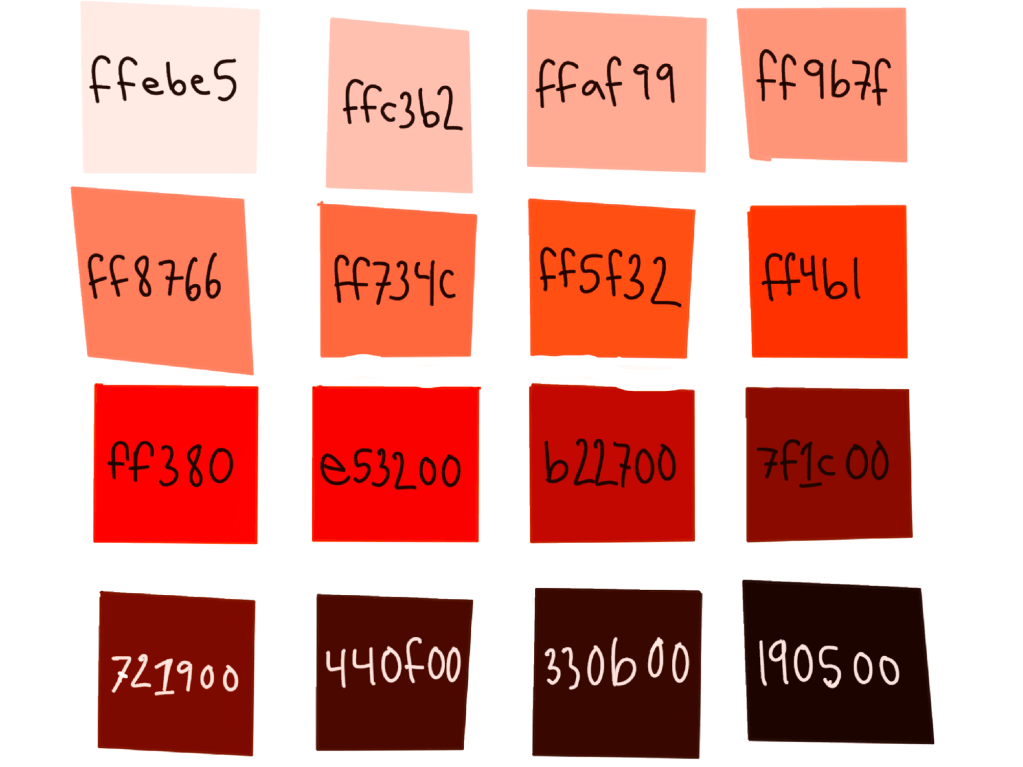
I did some digital experimenting for y’all with the color using its registered hexadecimal and I was surprised by my results of tint and shade. Upon tinting the pure shade I expected to get some sort of pinky hue but I was mistaken! When tinting coquelicot you get progressively more orange colors! Ultimately, you get the perfect peach hue. When shading coquelicot, however, you get rich, earthy reds and a fabulous black that’s perfect for landscape work!
A Complex Meaning For A Complex Color
Since coquelicot is directly a result from our fascination with the color of poppies, I think it’s safe to link their meanings too.
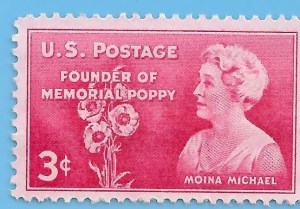
The poppy has a beautiful ability to grow in the most dire landscapes and indeed grows all over the world. Here in Berlin I tend to find them growing out of trash laden dirt heaps, a beautiful testament to natures resistance. Throughout WWI poppies were no stranger to hallowed ground — often sprouting up out of war torn soil having been watered with blood and tears. As a result of their appearance on the battlefield a Canadian doctor serving in the Canadian Expeditionary Forces, John McCrae, wrote the poem Flanders Fields. The poem is based on the battlefield of the same name where a million soldiers from 50 different countries were wounded, killed or went missing. Here is an excerpt: “In Flanders fields the poppies blow between the crosses, row on row”. After reading his poem Moina Michael, a humanitarian, campaigned in 1918 to have poppies symbolize the loss and remembrance of the fallen soldiers and the enduring human spirit.
In ancient medicine and in modern day the opium poppy has been used to produce strong sedatives and in this way also represent peace, and being at rest. Earlier than WWI, the ancient Greeks would offer poppies to Athena and placed them on graves as a symbol of everlasting sleep.
Poppies grow all over the world where we all experience sorrow, grief, loss and hope. We all eventually close our eyes for everlasting sleep. In all these things, what a bittersweet and complex meaning this delicate flower, and color, carries for humankind.
Coquelicot In Art
Here are four of my favorite pieces I’ve found where I see coquelicot in action!
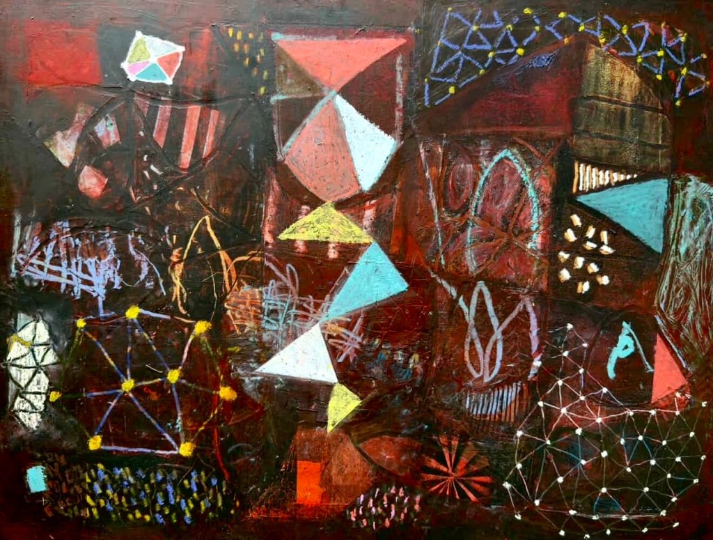
The first piece we will explore using coquelicot is by Anne Hebebrand. An abstract painter, Hebebrand has a profound sense of color and composition. I was stoked when I saw her post a photo of this piece below, because it has an intriguing dash of coquelicot in it! In person, Anne’s paintings are extremely textured. They tempt the viewer to reach out and touch and dig through the layers of paint, yearning to uncover what hides beneath. With valleys and mountains of applied paint and cold wax this piece feels as if you’re looking at a planar view of multiple dimensions. A place where galaxies and timelines are all connecting, building, exploding, stretching, twisting in the fabric of time. There, just in the middle, we find our angular path guiding us, like Alice through the looking glass, on a descent towards a foreign, coquelicot tinted world. I asked Anne if there was a specific intention behind the vibrant mark to which she said;
“as to the red, all I can say is I wanted a little punch and all you need is just a piece. I also think the triangles lead right to it, it’s a nice surprise at the end!”
And so it is! The more you look, the more you see but no matter where my eyes travel I’m constantly invited to step through that little coquelicot door.
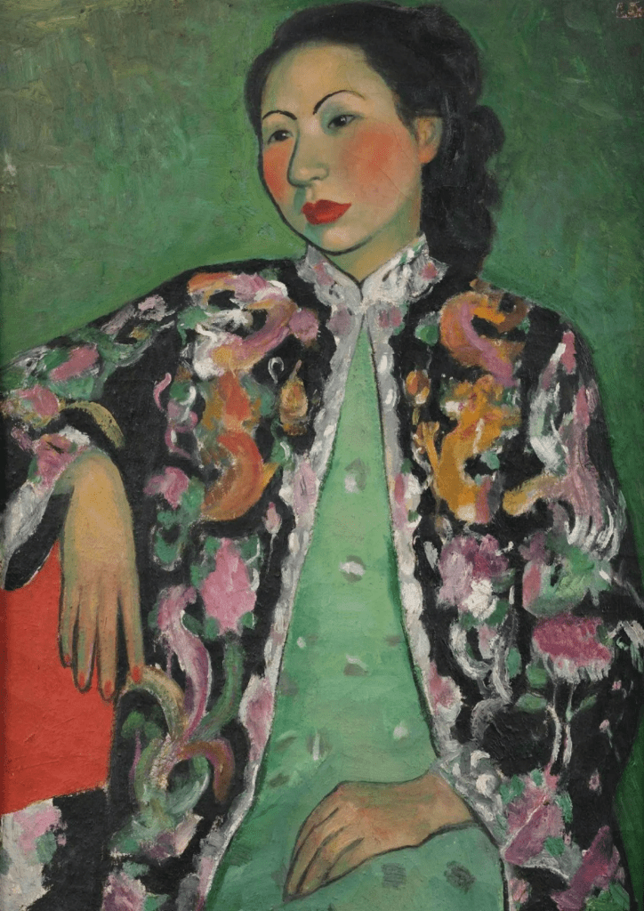
I mentioned before that this color was a staple on Fauvist palettes and I wasn’t kidding. The Fauvists seem to use this color almost as a neutral, if you can believe it. Everywhere I saw it, it somehow worked with the colors around it- even if they were less saturated and wholly dissimilar. Take Pan YuLiang’s self portrait below for example. She uses a complementary palette of red and green, and yellow and purples. Instead of being high contrast, as complementary color palettes sometimes are, the coquelicot somehow becomes a beautiful accent color to the washed out sage. Pulled out from the bottom left and up into the face of the sitter it helps move our eyes around the painting helping us to visually understand that the contrasting colors do in fact have a unique synergy. The coquelicot also becomes a visual binder between the yellow and the purple-pinks rounding out a cohesive color palette!
In another more current usage of the color I have included Octopus by Daniela Balsamo. In this work the striking coquelicot colored fish acts as an anchor for the eye amongst the sea of purples and blues. The coquelicot fish serves to help our eyes glide across the painting as we find its hue reflected in the textile on the table. Without the use of the coquelicot our eyes risk becoming stagnant among the swimming purples. A genius trick by Balsamo to add fiery excitement to an otherwise serene still life. Reminiscent of the Dutch still life masters, the out of place fish adds a layer of mystery. The blue fish may agree, as it peers at the red one wondering ‘you don’t seem to belong here…’.

© 2025, Nuar Gallery.
Looking at Suzanne Valadon’s, The Abandoned Doll, I feel a sense of loss deep within the coquelicot hue of the bedspread. A painting depicting the transition from childhood into adolescence, I can feel, in the paradoxical symbolism of coquelicot, an unspoken loss that comes from leaving childhood behind. Yet the blanket appears soft and comforting inviting sleep, but it’s also red. Red, like the first time Mother Nature pays us a visit and stains our sheets, initiating us into the journey towards womanhood.

In the ways that coquelicot seems to bring together otherwise polar elements, perhaps you can find inspiration for your daily life. Throw a coquelicot colored vase into your bookcase. Splash it into a monochrome outfit in the form of a kitten heel or a scarf.
It’s a powerful color and you’re a powerful person. Experiment and have fun!
Thank you for reading. If you liked what you read or were inspired, be sure to let me know in the comments or share the post with your friends 🩷!

Leave a comment